VimUI: Vimocity’s design system, built in code
- Platform
- Design systems
- 2022–present
- Key result
- Reuse ~10% → 80–90%
- User value
- The same components, accessibility, and light and dark modes across the web portal.
- Business value
- Pages built from parts that already exist, and every change made once.
- Stack
- Storybook
- Tailwind CSS
- shadcn/ui
- Radix
- Related case studies
Problem
Vimocity’s web portal, mobile apps, and V-minder, the Windows app, had each drifted into their own patterns. Our goal was one system the whole product could be built from. VimUI started as a thorough Figma system, with published libraries, variables and modes, and versioned releases. But every change happened twice, in Figma and then in code, and the second pass pulled a developer off their work to translate the file.
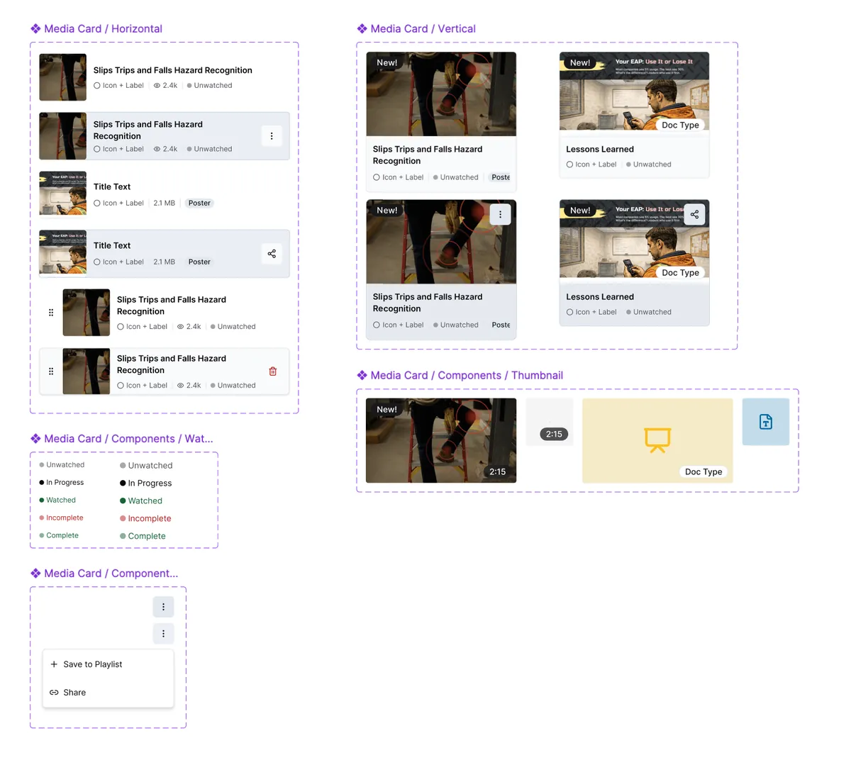
Design challenge: keeping design and code in sync without making every change twice. Once we prototyped in real components, the Figma file was a second copy of something that already existed, so we retired it and made code the source of truth. I knew Figma well enough to see where it stopped paying off.
What I did
- Built 50+ components in code. They follow atomic design (atoms, molecules, and organisms), starting from open-source foundations and rewritten where we needed more.
- Tokenized color, type, spacing, and sizing. Hardcoded values came out of the frontend.
- Built accessibility into every component. Keyboard support, contrast in both modes, touch targets, and reduced motion come with the component, so every feature inherits them.
- Released it in versions. Apps can test a change before it lands.
- Used AI to speed up the handoff. Until the Figma file was retired, I fed designs to Claude Code through Figma’s APIs.
Outcome
~10% → 80–90%
of frontend code built from reusable components
0% → 99%
token use; the last 1% is deliberate overrides
Changes now happen once, in code.
Who did what: I built VimUI and maintain it. The engineering team builds the web portal from it, and I review their frontend changes.
What I’d change: generate every platform’s tokens from one file. The components are the web portal’s alone, and the other apps get the tokens copied by hand, so consistency there holds by discipline rather than by a build step.
| one codebase | React Native and Electron: separate codebases | |||
|---|---|---|---|---|
| Web portal | iOS | Android | Windows | |
| Tokenscolor, type, spacing | source of truth | copied by hand | copied by hand | copied by hand |
| Components50+, React and Radix | VimUI | its own | its own | its own |
| Login & accountruns in a webview | VimUI | VimUI | VimUI | VimUI |
See it: the component library is public at vimui.vimocity.com.